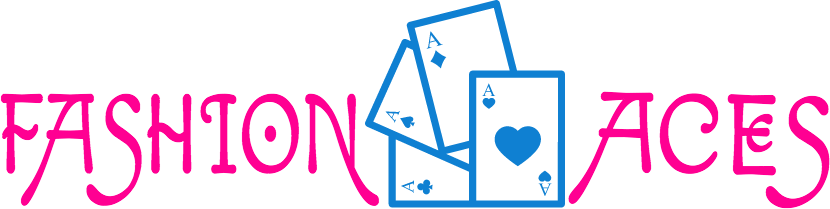
FASHION ACES
From Graphic Design to Visual Arts to Web Design and Fashion Design
– An Educational Community Project aimed at achieving World Peace.
This project was founded on St. Valentine’s Day, 2015, as a consequence of creative passion confronted with adversity when the rules of the game were changed.
An assignment in a Graphic Design class at The Working Men’s College in London was to design four postage stamps on the subject of “Fashion”.

Our distinguished teacher, Tony Jennings – a graduate of the Royal College of Art – in addressing the class in his low-key, humble way, nevertheless uttered the keyword – after a dramatic pause – right into my left ear.
Consequently the word F-A-S-H-I-O-N invaded my brain so precipitously that it seemed that only seven letters in electrified capitals in Ziggy Stardust colours crowded the space between my ears.
As my brain processed this sonic explosion – like a FANTASIA animation – its little grey cells immediately interpreted it into the song “Fashion” by David Bowie.
Fashion!
Turn to the left
Fashion!
Turn to the right
Oooh, … FASHION!

It was exciting to have an immediate experience of the word in its purest form as naked utterance and also that I had an immediate and unchallenged vehicle to run with.
We were given time to research the subject, but I was like a duck to water and immersed myself in the word starting with Shakespearean Theatre and Costume Design for a broad sense of the subject in Time, and visited the Fashion and Costume Collection at Chelsea Reference Library on the King’s Road.

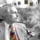
By working through my interests in the Military, Theatre, History, and Photography, the photographer Sir Cecil Beaton magically emerged as the keystone to my project.
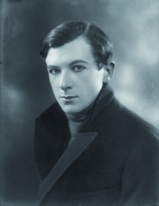
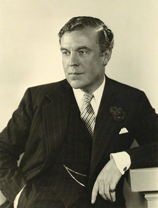
The actor and playwright, Sir Noël Coward came up as an icon of fashion in so far as he embodied style and sartorial elegance, and to whom I had once been likened.
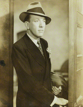
Demanding attention and respect was Sir Norman Hartnell, who designed the Queen’s coronation robes.

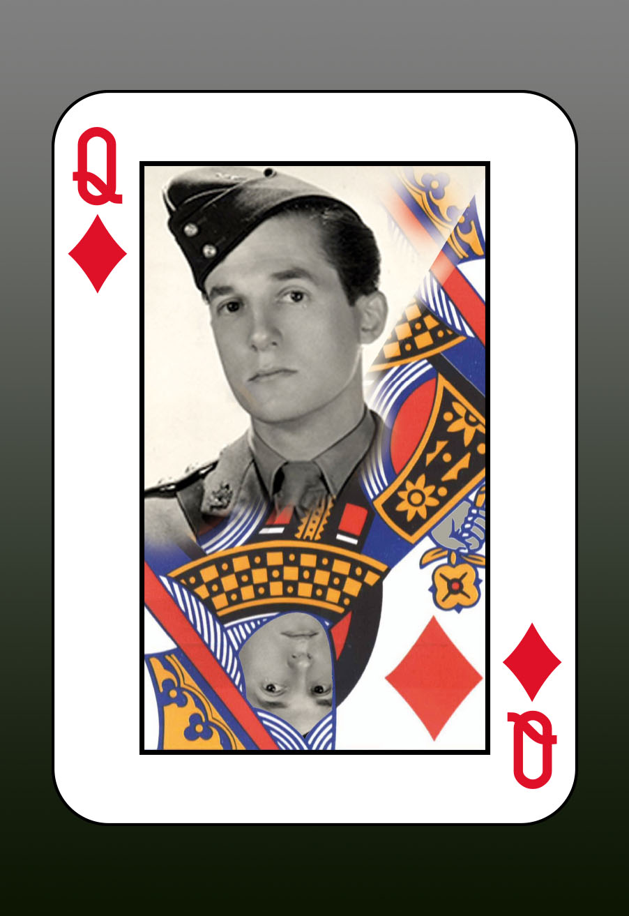
Finally, my one and only favourite 1950s rock’n’roll designer, Sir Hardy Amies, also a favourite designer for the Queen, had to be included.

The quartet made up a neat set, although somewhat old-fashioned, male, and British, but to me they represented the heart and soul of Britain in the mid-Twentieth Century. All four were born in London, England, within a decade between 1899 and 1909, they were active between the two World Wars, and all four served the nation during the Second World War.
They were busy in the post-war period, especially the 1950s, but no longer really “with it” when the 1960s Fashion revolution occurred, and definitely high and dry – if alive – in 1976 and 1977, when the Sex Pistols shocked and rocked the nation.
Nonetheless, all four (not the Sex Pistols) were Establishment figures and household names and were knighted by the Queen.
All four were apparently homosexual, so I perhaps a little cruelly dubbed them as Queens, although upon reflection, I do not think that they could have objected very much.
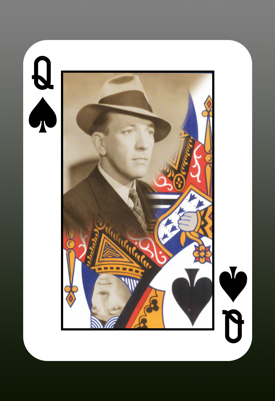
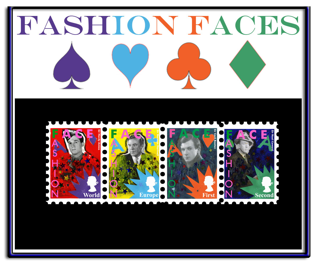
The four stamps were to be the four playing cards halved with the four fashion icons. I gave each one a Suit (pun intended) as the four Queens in a pack of playing cards, so that Sir Noël Coward became the Queen of Spades:
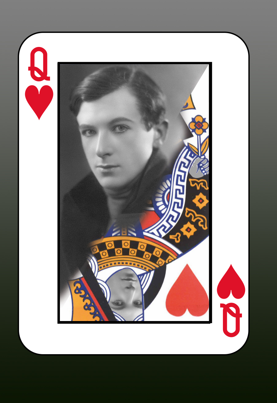
Sir Cecil Beaton the Queen of Hearts:
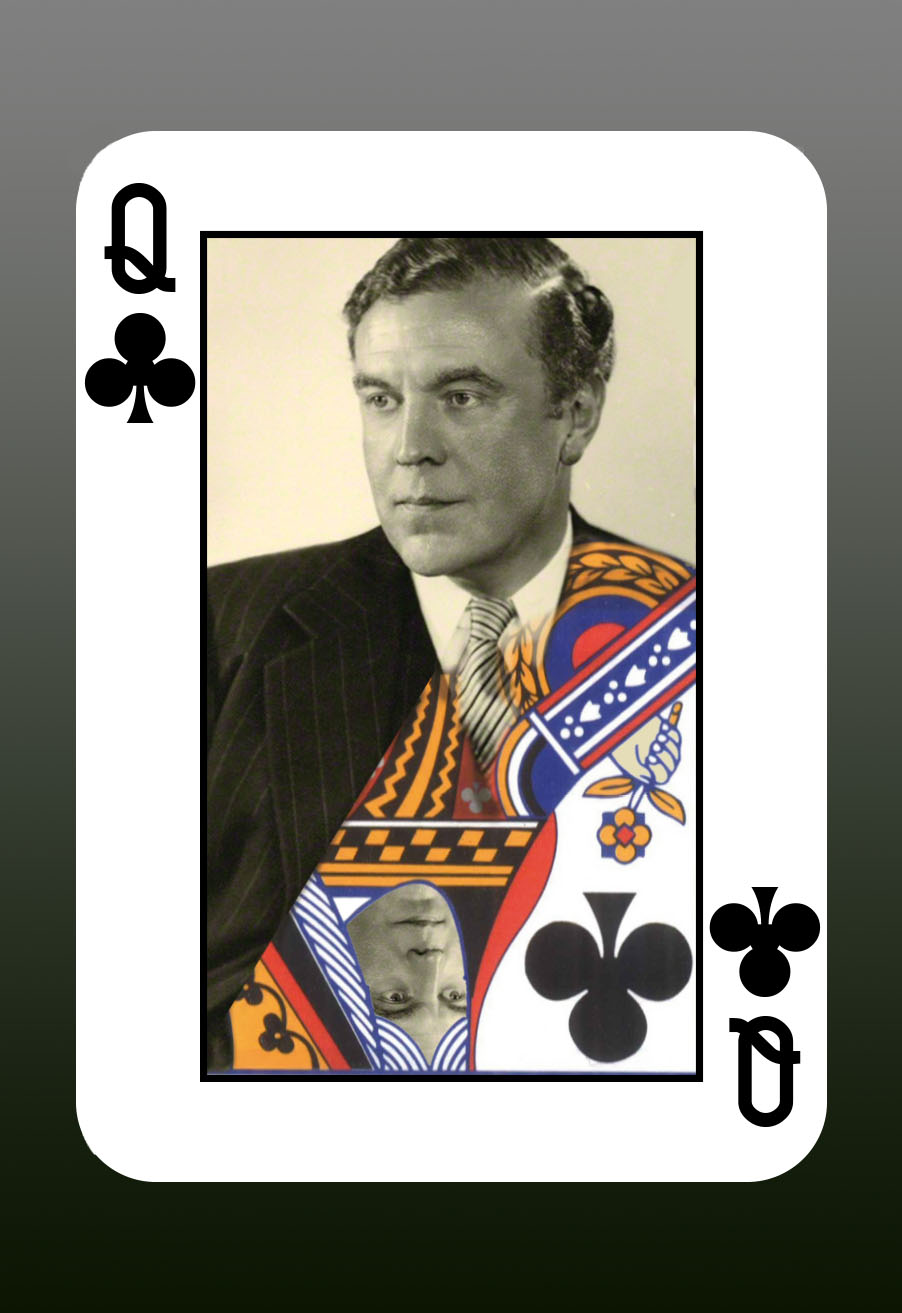
Sir Norman Hartnell the Queen of Clubs:
and Sir Hardy Amies the Ace of Diamonds:
The task was to use the computer to make the magic happen, but it was at this moment that the rules of the game were changed.
Suddenly, I was told that I was not allowed to proceed with a purely computer-graphic design solution, but had to first render all preliminary work in “mixed media” to comply with what we later understood to be the requirements of a Visual Arts course as opposed to the Graphic Design course we had enrolled on.
This threw me completely and literally sent me back to kindergarten, as I messed about with finger-paints, stick-on-stars, coloured paper, scissors, glue and glitter and plastic jewels (which I never used). However, Tony granted me a special dispensation, whereby he would mark me for my original concept as long as I fulfilled the requirements of the mixed media brief. This was some relief, but it meant that I had to shelve my real design project in order to comply with the surprise stipulation.
Sitting at my table in the Ruskin Art Room like a child on his first day at kindergarten I retained the idea of the four suits, but for the sake of simplicity, decided to upgrade the four icons from the status of Queens to the supremacy of Aces.


The whole operation was nauseous, but inescapable, so I had to own my uninspired efforts as my work. I adopted a primary colour palette for the new work instead of the more subtle tints that I had in mind for my original vision, and got busy with paints, paper, coloured card, scissors, ink and glue – and stick-on-stars. The idea was to be explosive and elemental, but I was floundering most of the time, and was embarrassed at the result. My only consolation was that Tony remarked that I had certainly used “mixed media”. The mixed media images were now to be scanned, but this was randomly done at the last minute, but I did not care much so long as a usable scan for each image was achieved. We were now able to use computers to complete the project. We were provided with a template of four stamps and an image of the Queen’s head. I found that I had scope to indulge my interest in typography, which was some consolation. What was interesting was that by juxtaposing “Fashion” and “Ace”, following The Clash’s typograpical design on “London Calling”


I arrived at “Face”, which coincidentally so resembled the logo of the Fashion magazine “The Face”, that Tony assumed that I had actually borrowed it from the magazine. I was quite excited by this coincidence and had renamed the set of stamps as “Fashion Faces”.
It was seeing my work – that had turned out better than I had expected – projected on the North wall in the darkened Ruskin Art Room with an audience, that I decided to go further and create a website. It struck me that the journey had been an organic process in which I was but a part. Cecil Beaton had emerged as the keystone – as both a King and as a Magician -while I had originally selected the photos of the four iconic British fashionistas to match as closely as possible the faces of the four Queens in a deck of cards. Then, forced into mixed media, I had changed the cards from Queens to Aces, and finally, by making other fairly random/half-conscious choices such as colour-scheme and denomination , I found that the order I had begun with, Spades, Heart, Clubs, and Diamonds had been completely reversed!
Berkeley Vincent.
© Berkeley Vincent, 21st March, 2016.
